React UI Kit
React UI Kit — Atomic Component System & Workbench
This project is a custom-built React UI kit designed around atomic component architecture, a flexible style system, and first-class developer tooling. The goal was to create a reusable, extensible component foundation that could scale beyond individual components and support real applications, not just isolated UI demos.
The work spans component architecture, styling primitives, documentation tooling, and example applications built entirely from the system.
Problem
Many UI libraries focus on visual components but fall short when it comes to long-term scalability, composability, and real-world usage. Components are often tightly coupled, difficult to theme, poorly documented, or disconnected from how applications are actually built.
I wanted to explore what a UI kit looks like when it is treated as a system, not a collection of widgets:
Clear layering and composition rules
A consistent style foundation
Strong documentation and preview tooling
Proof that the components work together in real applications
Atomic Component Architecture
The UI kit is built using a layered, atomic approach:
Primitives handle layout, typography, spacing, and interaction foundations
Base components compose primitives into reusable UI elements
Composite components combine base components into higher-level patterns
Application patterns demonstrate how components are used together in real contexts
Each layer has a clear responsibility and stable contracts, allowing components to evolve independently without breaking downstream usage.
This structure reduces duplication, enforces consistency, and makes the system easier to reason about as it grows.
Custom Style System
Instead of relying entirely on an off-the-shelf styling solution, I built a custom style system that drives all visual output in the UI kit.
Key characteristics include:
Centralized style definitions
Consistent spacing, typography, and color usage
Theme-friendly configuration
Predictable styling APIs across components
This approach ensures visual consistency while allowing the system to adapt to different themes or application needs without rewriting components.
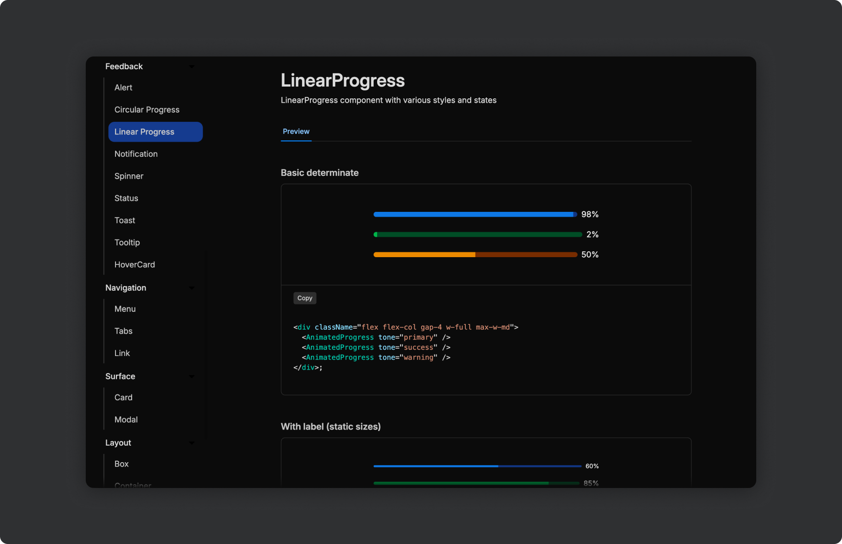
Component Documentation & Workbench
A core part of the project was building internal tooling to support the UI kit.
I created a custom documentation and component workbench that allows developers to:
Preview components in isolation
Toggle props and variants through interactive controls
Test layout behavior and edge cases
Understand component APIs and usage patterns
This tooling serves both as documentation and as a development environment, making it easier to build, test, and adopt components safely.
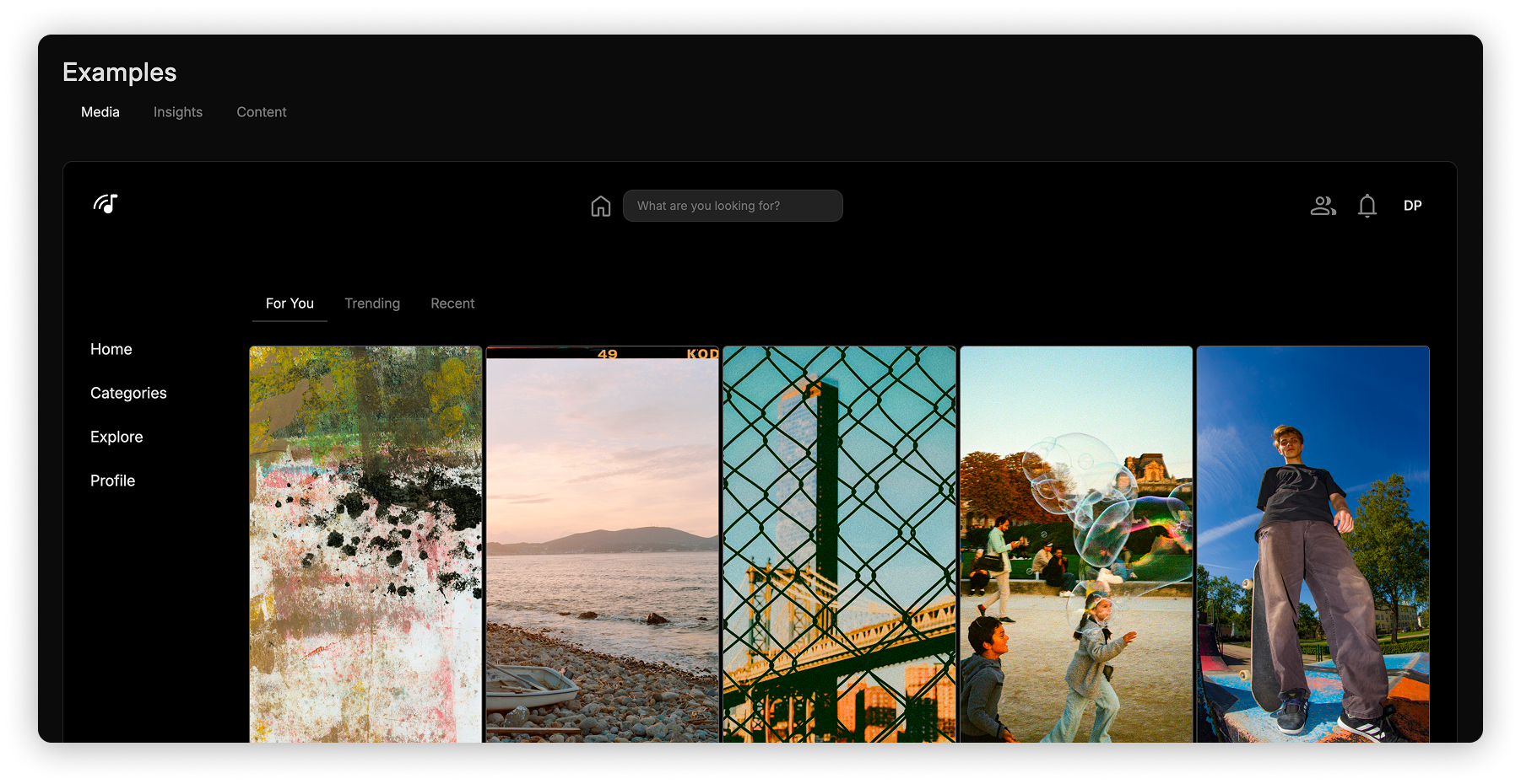
Real Application Examples
To validate the system, I built real example applications entirely using the UI kit. These applications demonstrate:
How components compose together at scale
Consistent styling across complex views
Reuse of patterns without custom overrides
Practical usage beyond isolated component demos
Building real applications surfaced gaps and informed improvements to the component APIs, documentation, and style system.
Technical Focus
This project emphasizes system design and developer experience over visual novelty.
Key areas of focus include:
Atomic component design and composition
Custom styling architecture
Tooling for documentation and testing
API consistency and predictability
Real-world validation through example applications
The result is a UI kit that can act as a foundation for multiple applications rather than a single-use component set.
Status
This project is actively under development and continues to evolve as new patterns and requirements emerge. It serves both as a reusable UI foundation and as an experimental space for refining component architecture and tooling strategies.