Color as a system
@da_poling| (1y ago)
When I started building the palette module for the design system, I made the same assumption most people make: color is a list of decisions. Pick a primary, pick a neutral, name them, document them, move on.
What I did not anticipate was how quickly that model breaks down in practice. A designer would choose a strong blue that worked perfectly for a button or selected state, then that same blue would behave differently as a border on a light surface or a hover state in a darker context. Nothing looked obviously wrong, but the system drifted into inconsistency.
The issue was not the color itself. It was how the color was chosen. Manual selection optimizes local moments, not relationships across the whole interface. A design system only feels consistent when those relationships are intentional.
Derivation over decisions
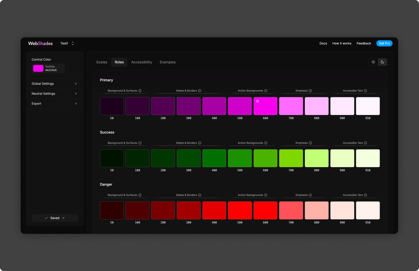
That pushed me to a different question: what if I derived colors instead of choosing them one by one? WebShades started from that idea. You provide one color, and the system generates a tonal scale with lighter and darker steps at consistent intervals. The primary stops being a static decision and becomes an input parameter.
The generator is deterministic by design. The same input always returns the same output. At first that felt restrictive, but it became the core advantage. Consistency is less about always making great decisions and more about making the same decision reliably across contexts.
Testing under pressure
Implementing the generator was the easy part. Evaluating it was harder. A palette can look correct in isolation and still fail in product conditions. Mid-tones that pass in text may disappear as borders. Light surfaces can collapse hierarchy when foreground and background values get too close.
To stress-test the output, I built a live React rendering layer that applied generated palettes to real components in real time. Buttons, inputs, cards, disabled states, hover states, and typography all updated together as the input color changed. That made failures visible immediately.
What surprised me
The first surprise was that the light end of the scale was consistently the hardest to get right. Saturated bases often looked strong in darker steps but collapsed in lighter ones: not enough contrast for text, weak borders, and poor separation between adjacent surfaces. The math was technically correct while the output was perceptually wrong.
I added a compensation layer that applied non-linear lightness adjustments, preserving contrast near the extremes without flattening the middle of the scale. That tradeoff improved practical usability more than any single tweak to hue or saturation.
The second surprise was theming. Once an entire palette is derived from one base value, theme switching stops being a long list of manual overrides. It becomes a single parameter change that re-computes the full system. In practice, that reframed themes for me: not collections of colors, but points in color space that the system knows how to expand.
How it fed the contract system
That idea flows directly into the component layer. Instead of storing large resolved color sets per theme, we store base values and generation strategies, then derive palettes at build time. Names like neutral-high-monochrome and blue-medium-dual are strategy labels, not static swatch dumps.
WebShades started as a way to reduce manual color work, but it ended up changing how I think about system design in general. The same logic extends to typography scales, spacing systems, and radius ramps: fewer independent decisions, stronger internal consistency.
I still use WebShades as the starting point for new palettes because it is faster and more coherent than manual selection. More importantly, it reinforced the principle I keep coming back to: if you want consistency at scale, design for derivation, not one-off decisions.